


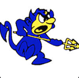
In our generation of students, everyone has seen the iconic Warren Blue Devil; but in a few years, many may never know that it has ever existed.
Concerned teachers and parents have decided that it would be better for the school if they were to replace the iconic blue devil logo with a trident or “fork” logo. The new logo is much simpler, cleaner, and maybe even less controversial; but is it better? The old logo captured the spirit and personality of Warren. Through a fun logo connecting to the school mascot, the devil logo was a hit, expressing the school’s spirit and enthusiasm. Many loved it and even thought it was cute, creative, and legendary. But others, not so much. Some say that it’s ugly, while others say that the smurf-like character is outdated and not intimidating enough. Some even say that it is controversial and could potentially give the school a bad image.
While we can remove the blue devil from the school’s merch, websites, and anywhere visually, it can never be erased from history, and our hearts. Although current Warren apparel and merch have the new trident logo, many older Warren students still have the original Warren merch with the blue devil. Students with this apparel will continue to wear it, despite the logo being different. This will cause inconsistency in the school logo throughout, but will also ensure that the blue devil’s legacy is never forgotten. Welcoming people into the building over the years, the blue devil is a staple of the Warren community. It is important to the school spirit and overall togetherness of Warren. It would also be a hassle to try and remove it from the building, both in manual labor and to erase such a memorable staple from our minds.
The Blue Devil is Warren’s known figure. Other schools know us as the Blue Devils, and connect us to our logo. If they see a blue devil, they know it’s us! By changing it, we might be confusing other schools and even be seen as indecisive for not sticking with a logo. As well, the new Warren trident logo is almost an exact copy of Arizona State’s logo, only in a different color. This makes the logo very unoriginal and less unique, which is not fitting for Warren.


What else is the blue devil that the trident isn’t? Creative! The blue devil is a super creative logo, with neat details and a lot of thought put into it. Although the trident is also neatly designed, it is a lot simpler and modern. This isn’t necessarily a bad thing, considering every person has their own opinion on modern versus traditional art and design style, but we can all agree that the original blue devil logo is a lot more creative.
The new logo, however, is not all that bad. Being much simpler to recreate, it will be easier to print and/or draw on t-shirts, posters, etc. This could increase warren spirit by making the logo more widespread and recognized. In addition, the new logo still connects back to the blue devil, but in a less strict and more open-ended way, making for less controversy. This way, it still matches with the mascot and blue devil concept without directly referring to it. With its neat style, the new logo is also more minimalistic and clean looking all while looking modern.
Regardless of what your thoughts on the new and old logos of Warren are, the original blue devil logo will never be fully gone. Remembered through old merch, school spirit, the mascot, and more, the original blue devil logo will continue to live on! Go Blue Devils!